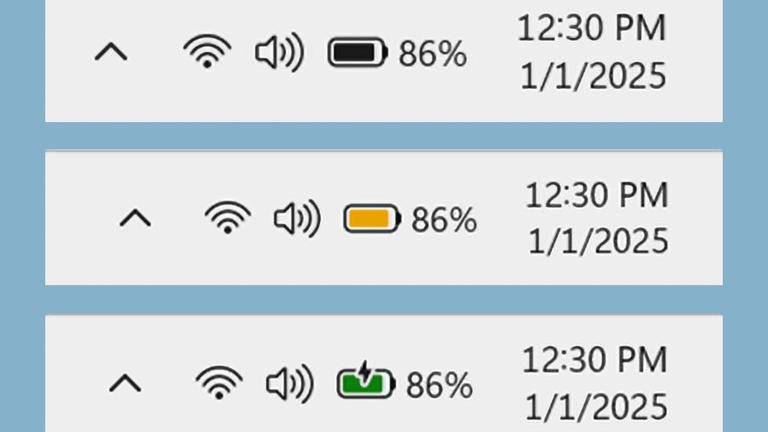
Microsoft continues to refine Windows 11 with meaningful updates, and its latest enhancement focuses on a feature that is both essential and often overlooked: the battery icon. Unveiled through the Insider Preview Build 26120, the redesigned battery indicator now features a color-coded system aimed at improving clarity and convenience. While the update might seem minor at first glance, it addresses real-world frustrations and highlights Microsoft’s commitment to user-focused design.
Few things are as disruptive as an unexpectedly drained battery. Whether it’s during a work presentation, while binge-watching a favorite show, or in the middle of important online tasks, running out of power at the wrong moment can be a major inconvenience. Microsoft’s new battery icon design is set to alleviate that stress by making it easier to notice and act on low battery levels before they become a problem.
The new color-coded system introduces three key indicator colors: green, yellow, and red. Green signifies that the device is charging and the battery is in good health. Yellow serves as a warning that the battery level has dropped below 20%—often when power-saving mode kicks in. Red is designed as an unambiguous alert that the battery is critically low and requires immediate attention.
This seemingly straightforward update addresses long-standing user demands for a more intuitive way to track battery status. According to Microsoft, the redesign stems directly from feedback collected from customers and Windows Insiders. For users who often find themselves scrambling for a charger or troubleshooting dead outlets, this addition is more than a facelift—it’s a solution for everyday challenges.
The revamped icons will gradually roll out across various parts of the Windows 11 interface. Users will first notice the updates in areas like the system tray on the taskbar, the quick settings flyout menu, and the Power & Battery section of the system settings. Additionally, Microsoft plans to expand the color-coded indicator to the lock screen in future builds, though this is still in development.
The redesign goes beyond just adding color. Microsoft is also addressing smaller usability issues, such as the charging overlay icon obstructing the battery charge bar. In the updated design, this overlay will no longer block the visual representation of the battery level. Another handy feature being introduced is the option to display the exact battery percentage next to the icon on the taskbar. This feature can be enabled in Power & Battery settings, catering to users who prefer more precise information at a glance.
What sets this update apart is its focus on practical concerns. Rather than applying changes purely for aesthetics, Microsoft’s approach is rooted in improving everyday interactions. By making battery status clearer and easier to understand, the new icons aim to reduce downtime and keep users informed, whether they’re working, traveling, or simply enjoying their devices.
As part of the Insider Preview program, these updates are being rolled out gradually, allowing Microsoft to gather feedback from early adopters and fine-tune the feature before releasing it to all Windows 11 users. This phased approach underscores the company’s commitment to refining its updates based on real-world usage and concerns.


