


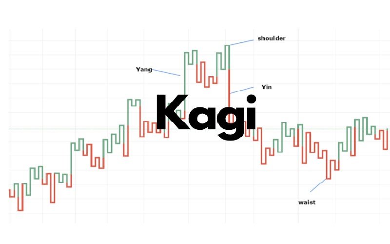
What is a Kagi chart?
The Kagi chart is a specialized technical analysis developed in Japan in the 1870s. It uses a series of vertical lines to illustrate general supply and demand levels for certain assets, including the price movement of rice, a core Japanese agricultural product. Thick lines are drawn when the price of the underlying asset breaks above the previous high price and is interpreted as an increase in demand for the asset. Thin lines represent increased supply when the price falls below the previous low.
What Does a Kagi Chart Tell You?
On the Kagi chart, an entry signal is triggered when the vertical line changes from thin to thick and is not reversed until the thick line changes back to thin. Like any other chart, these signals should be filtered based on other fundamental or technical criteria, as simply buying or selling every time the Kagi chart switches from thick to thin could prove costly and unprofitable. The line turns thick when a new high is made (if the line was thin). The line stays thick as long as a new low isn’t made. The line turns thin when a new low is made and stays that way until a new high is made (it turns thick).
The Kagi chart will increase as the price moves by the reversal amount or more.
These charts are independent of time and only change direction once a predefined reversal amount is reached. The reversal amount is discussed below.
Kagi charts, having no regard for time, have the advantage of reducing noise. Noise is a particular drawback of traditional candlestick charting methods. Because a change in price direction occurs only after a specific threshold is reached, some traders may find Kagi charts helpful in isolating the trend and viewing direction more clearly.
Depending on the trading or charting platform, the Kagi chart line may not be thin or thick but rather colored, such as red or green. The color changes signal a drop below a recent high or low.
Kagi Chart Reversal Amount
A Kagi chart will reverse direction when the price has moved in the other direction by a specified amount (or more). Assume a trader is trading Apple Inc. (AAPL), and they want the chart to show when there is a $10 reversal. A Kagi chart can show that.
If the Kagi chart (and price) increase to $300, the Kagi will not reverse until the price drops below $290. If the price rises to $350, the kagi won’t reverse until the price drops below $340. If the price falls to $340, the kagi will not reverse higher until the price moves back above $350.
The $10 reversal is a moving target. The $10 reversal can be based on closing prices or highs and lows.
The reversal amount doesn’t need to be a fixed amount. It can also be based on the Average True Range (ATR), which means the reversal amount will change as volatility changes.
When the Kagi chart reverses, it draws a horizontal line at the low or high price (close, high, or low, depending on which is selected) and then reverses. It will continue to move vertically until there is a reversal.
These are directional changes on the chart. The lines change color or switch from thick to thin highlights when a prior Kagi chart, high or low, is breached.
Example of How to Use a Kagi Chart
The flowchart shows a Kagi chart of Apple based on 1-hour closing prices. The reversal amount is $5. Three examples of the Buddha Bottom were also highlighted, which signaled buying opportunities.
Generally, the Kagi switches to green when the price moves above the prior Kagi high and switches to red when the price drops below the prior Kagi low.
The Difference Between Kagi Charts and Renko Charts
The Kagi and Renko charts are both based on reversal amounts. Bricks that only move at 45-degree angles and never occur next to one another make Renko charts. Each brick has a specified amount. The price must move two brick distances to get a reversal on the Renko chart since there are no side-by-side bricks.
The Limitations of Using Kagi Charts
Kagi charts are sensitive to their settings, and with poor settings, they can be as noisy as other charting methods.
Once a “good” setting is found for a particular asset, that setting may not work well on another asset. The trader, therefore, may need to find Kagi settings that work for each asset traded.
For some traders, the trend may be more challenging to identify with the Kagi charts, with the line thickness (or color) changing and the chart itself moving up and down in vertical lines. While trade signals with Kagi charts will have some similarities to other chart types, like candlesticks, Kagi charts have unique features that may require additional study to take advantage of.
Many general buys and signals generated by Kagi charts won’t be profitable over many trades until combined with other forms of analysis to help filter trades.
Conclusion
- Kagi charts change orientation when a price reversal of a specific amount or more is excellent.
- The chart will continue to advance in that direction until the set amount of price reversal occurs in the other direction.
- When the price rises over the previous Kagi high, the line thickens (or goes green), and when the price falls below the previous Kagi low, the line thickens (or turns red). Until the opposite signal happens, the line remains thick or thin.
- Changes in direction, line thickness, and other patterns can provide buy and sell signals.