The online rental marketplace for housing, Airbnb, announced its rebranding initiative on Wednesday, July 16.
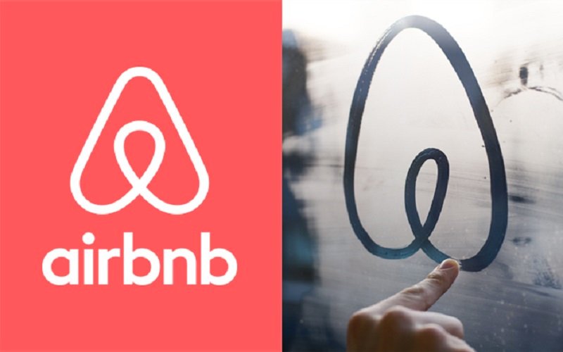
Airbnb introduced a new layout of its website and, more importantly, a new logo. According to Airbnb, the new logo means four things: a weirdly happy person, a place pin, love and the letter A for Airbnb.
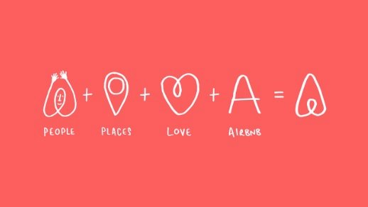
Via Airbnb
The company hopes to bring the sense of belonging to Airbnb users with the new design. It calls the new logo, “Bélo.”
Airbnb also offers an online-tool that allows people to create their own “Bélo.” It provides users this interaction because it wants to remind people that everyone is unique, but they are part of a community at the same time.
While some people appreciate the new look of Airbnb, others do not understand why the company would launch a logo like that. However, the company got the attention of people, which matters more than if they actually like the logo or joke about it.
.@_DesignStudio_ rebrands @Airbnb and it looks great! Great work! – https://t.co/Kl0V8VL3Jj #belo #BelongAnywhere
— Filipe Guerreiro (@filiperuivog) July 17, 2014
I’ve never enjoyed a logo unveiling more than the #airbnb #belo https://t.co/9vXHvQQYAP
— Rachel Smith (@The_FoodIEat) July 17, 2014
Airbnb’s new logo is a rorschach test where the only correct answer is vagina. pic.twitter.com/7thtD0KlbH
— Seamus Condron (@SeamusCondron) July 16, 2014
Love the new Airbnb brand except that mark – looks like certain body parts. Definitely grown the brand up though. #gratitude.
— universal symbol of (@jongold) July 16, 2014
The California-based company was founded by CEO Brian Chesky and CPO Joe Gebbia in 2007. The founders were inspired to the Airbnb idea because they did not have enough money for rent and had extra space in the house. They thought they would provide an air bed and breakfast, which formed the company name, for traveling tenants. Airbnb has grown into a billion-dollar company now.










Comment Template